Wednesday, May 11, 2011

One for my bucket list....

--------------------------------------------------------------------------------
This morning as I was responding to email I thought I would look at a blog created by a teacher named Lorna (Artymess)  who has been working with her students creating butterflies for our project. 

Her latest post (appropriately titled "What a Hoot" ) is  found here, and below is just one of several photographs captured of her daughter's visit (a birthday gift).  The others are on her blog. 

I h a d to write Lorna  back to find out where this  sanctuary was located and also if I could share  her blog post here. 


The falconry is  Forest Falconry...which, happens to be across the 'pond' from my neck of the woods in the United Kingdom.  Here is the link to the centre website. 

Lorna also commented that her daughter   had to support her arm when she was holding the Eagle Owl as it was so heavy!

Thanks Lorna for giving me something to add to my 'bucket list'! 

Sunday, May 08, 2011

More Butterflies in the Gallery from Carstairs Elementary School

--------------------------------------------------------------------------------
Photographing and cataloguing 127 butterflies can take time, but it  is also an opportunity to  study each unique butterfly.  In doing so, I've noticed some startling themes running through the Carstairs Elementary School group of butterflies. 

This project was initiated at the school by the Grade 4B class who were studying about the Holocaust as part of their language arts and history lessons.  They were reading an account of a family known as the Brady's who were involved in the war.  The novel they read is Hana's Suitcase - the website is accessible here.

Hana Brady  1931 - 1944

Hana Brady was born in NovĂ© Mesto, Czechoslovakia. She and her older brother George watched their parents being arrested and taken away by the Nazis.   They were never seen again.   Hana and George were sent to the Theresienstadt (Terezin) concentration camp. In 1944, Hana was deported to the Auschwitz  concentration camp.   While her brother survived by working as a labourer,  Hana was sent to the gas chambers a few hours after her arrival on 23 October 1944.  Source:  Wikipedia


The words,  colors as well as brush strokes chosen and  reflected  in the  butterflies  made by these students clearly indicate to me how much they empathised and learned about the losses suffered, the importance of love and the hopes and wishes to stop hatred.


I have uploaded 24 more butterflies from the class.  If you have a moment, you can view them  by clicking here.  


Thursday, May 05, 2011

April in May Part 3 ....I promised I'd get busy with my 'hands off the computer' artsy stuff...

--------------------------------------------------------------------------------
and I stayed true to my word...well...kinda,sorta, maybe...

After photographing a portion of the butterflies this afternoon, I went on to capture a few shots of some of my 'hands-off-the-keyboard' work.  Then, it was on to cleaning up the mess I've created which in turn reminded me of one of the reasons digital work is so appealing..  Here`s just a few of the top reasons..

....no mess to clean up after
no thread bits hanging off my cuff
     as I reach for a glass of wine at a restaurant,
          only to notice the acrylic paint under my fingernails that looks like  dirty mud in the candle light.  

...to be continued...

 Ok - maybe not wine or candle light...  I'll be honest - maybe a diet pepsi and fluorescents at the local burger palace?

I lead such a glamorous life.  Truth is, most of my laundry last week was in the form of pajamas...oh but they are clean and smelling so fresh. 

end of digression..................................................................................................................................


On to the photos...

This project started out as a 4 x 4 inch fabric collage for a new project I'm participating in.  I was longing for spring to arrive and came across a photograph I had taken a few summers back of one of my favorite flowers - Sweet Peas....favorite because of how beautifully scented these ones were in particular.


After extracting the sweet peas from their background, I created the following for the front of the square... (pardon the overly saturated colors...)


followed by  a larger square  background to sew it on to....


.... the back that bears the 'signature' of the person as part of the specs for this particular project....


Off to the printer, and printed onto fabric (that's why the colors above are SO saturated!)  Followed by a bit of cutting and ironing on to some thick quilting stuff... we arrive at the non-digital portion of this post !


Here's the macros of various parts of the square after it fell under the sewing machine and picked up some stitches....


....and picking up a few beads along the way....and some FUN (to me) tatting gifted to me by one of my most  favorite soul sister-artists.... (Thanks!)


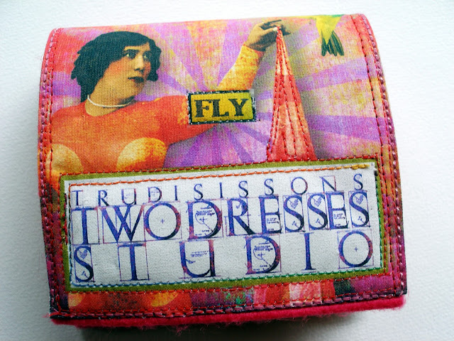
One thing seemed to automatically lead to another...and before I knew it, I had decided this would become a needle book to house my growing stash of needles...  (so much for getting a head start on this new project...)


 I gathered up some felt I 'knew' I'd need at some point in the future, along with the swirly black and white cotton fabric to line it...


....and since I'd already created the back part (even though I didn't really need 2dresses on it)...I left it there...


Now I have  little needle book and it has come in handy so much so, that I look forward to making another one and maybe one after that!  I think these may make great little birthday or shower gifts, or maybe find their way into a stocking or two at Christmas!

Very Important Image Credits:

Funky woman holding the fabric, the kaliedescopey looking spray of light for the backgrounds (although I changed the color)  , plus the word FLY - all from Tumble Fish Studio at http://tumblefishstudio.etsy.com

The little bird from - http://iktupilli.etsy.com

and the font used to spell TDS - from Evelyn "Finecrafted Designs" at http://deviantscrap.com


Thanks for reading and if you happen to know what species of Sweet Peas they are, please drop me a line....


Wednesday, May 04, 2011

April News in May (con't)

--------------------------------------------------------------------------------
Our butterfly cup runneth over...

Finding words to describe the package arriving in the mail April 19th  evade me.   Instead, I offer  this  photograph  taken upon opening it.

Butterflies from the students at Carstairs Elementary School


Bulletin Board at Carstairs Elementary School

The enclosed  note read:

"What a wonderful thing you are doing, bringing awareness of this project to Alberta.  Our class felt it was a meaningful way to remember Hana Brady from our novel study, "Hana's Suitcase" and we watched our bulletin board fill with butterflies from many other students in our school as well."  R.A.

Hot Links -
Novel Study - "Hana's Suitcase"

Photographing 127 butterflies individually is a welcomed challenge, but does take time.  Please bear with me as I 'chip away' at this process.   I will catch up ASAP. 

To the students and teachers who facilitated this project, a very big thank you times 127 for your devotion to bringing awareness globally to the hopes and dreams of all of us to STOP hatred.


Tuesday, May 03, 2011

Announcement of April 2011 Blog Giveaway, etc.

--------------------------------------------------------------------------------
Congratulations to Karen Owen, the winner of my April 2011 Giveaway and thanks to everyone who left feedback and commented on my 'new' collages.  

 I did 'bite the bullet' and decided to see what my digital illustrations would look like on glicee printed art paper shown below -  


For those of you new to this blog, or for those of you whose name wasn't drawn, please stay tuned for my  May 2011 Giveaway...soon....! 

Until  then, why not  head on over to Creative Solace - since a little bird told me there's something  tempting over there.....you won't be disappointed!

April in hindsight....

April was a wonderful month for me,  despite the inclimate weather.  Wonderful mostly because I had family visits from both of my daughters, my Dad and my stepdaughter! Oh, and also joining us was my grand-puppy - Maude


Back to blog designing....

Many of you may know, I have declined offers to continue offering my design services for blog makeovers for a long long time.   There were several reasons why, but mostly I needed a break.  April brought with it 3 requests for me to design blog headers, etc. and since it's a woman's perogative to change her mind, I took a few new ones on. 
 Over the past week I had the true privelege of working on a new blog design for Heather R. of Creative Solace (mentioned above). About 95% of the images I used come from Lorie Davison's images and were a true pleasure to work with.

I  put the final touches on it and uploaded it to her blog yesterday.  Heather has been a 'blog friend' for several years, and one of only a handful of Canadian blog artists I have come to know.  Over the past year, she took a break from blogging.  How I missed her thoughtful posts, inspiring artwork and positive energy.   Welcome back Heather~!

Here's a montage of her header and sidebar buttons:


Being an avid reader, Heather supplied me with a number of her favorite quotes, and the one chosen though not visible here comes from Kahlil Gibran  and reads as follows -

"Forget not that the earth delights to feel your bare feet and the winds long to play with your hair."

In 2009, Heather captured an amazing shot of a baby robin she'd been watching in her backyard and I wanted to feature her photography in her new header design somewhere.  Luckily, Heather had the original jpg and was happy to send it to me.  I haven't mentioned this to her yet, but this photograph was so crisp, you can actually see the reflection of people in the eyes of the robin! 

 Photograph - Heather Robinson - Creative Solace


Heather kindly granted me permission to  'play' with her photograph, and after completing her blog design, I plopped "Baby Robin" into this scene (from Lorie Davison).


New Fonts!
As you may notice, working on blog designs again inspired me to make a few changes on my own!  I was delighted to see there are more fonts available than the traditional web fonts.  If you haven't discovered them yet, take a tour through the custom template features and choose "Advanced". 


Thanks as always for taking the time to leave a comment. Although I don't always have time to reply, they are nonetheless much appreciated.  I'll be back tomorrow with plenty more things to share!


Monday, April 25, 2011

New Creative Team Work and New Digital Sheets from Tumble Fish Studio

--------------------------------------------------------------------------------
Hi again!  Hope everyone had a wonderful Easter !

Tumble Fish Studio just released 7 great new digital sheets available here!

The inspiration for this contribution using a few of her new images came from today's Daily Om.  To read the entire passage click on the DAILY OM box on your right in the sidebar.

Here's the portion that appears below:

"When the time comes for us to let go of the creations of our middle lives, we are like a tree in autumn dropping leaves, as we release our past attachments and preparing for a new phase of growth. The children move on, and careers shift or end. The lines on our faces, the stretch marks, and the grey hairs are beautiful testaments to the fullness of our experience. In the winter of our lives, we become stripped down to our essence like a tree. We may become more radiant than ever at this stage, because our inner light shines brighter through our eyes as time passes. Beauty at this age comes from the very core of our being—our essence. This essence is a reminder that there is nothing to fear in growing older and that there is a kind of beauty that comes only after one has spent many years on earth."


"Beauty" - digital illustration

Image Credits:
Tumble Fish Studio - all images with the exception of
Holliewood Studio (garbage can)


Friday, April 22, 2011

The Princess and the Pelican Puppet

--------------------------------------------------------------------------------
How many frogs have you kissed?


 Especially when your Mother was watching...


Have a cup of tea, and see if you can remember?


The Princess and the Puppet Pelican
8x10 Digital Illustration

Image Credits:
Holliewood Studios, Lisa`s Altered Art, Lorie Davison, N. Perry, Tumblefish Studio, Finecrafted Designs, Martha Van Eck  and public domain images, most noteably, Sir Edward Coley Burne-Jones (1833-1898)


Monday, April 18, 2011

Experimenting with Golden Digital Ground Clear (Gloss) Inkjet Transfer Method

--------------------------------------------------------------------------------
Good Morning!  

 If you've been following my blog for awhile,  you will already know I have recently been experimenting with various methods and products used for inkjet transfers.   You may recall a previous post, discussing my results with Lesley Riley's TAP (Transfer Artist Paper). If not, here is the link to that post.

If you are at all like me, I often come across a new product through a blog post or a video that looks like the next best thing to sliced bread.  I get excited and enthused and   purchase the product, convinced it will be 'the answer'!   By the time the product arrives, I have 'moved on' and it sits. 

 This is the scenario that occurred which lead  me to  shelving a 16 fl. oz bottle of Golden's Digital Ground Clear (Gloss) in my studio for over a year.

But,  I found the right amount of time last week to experiment.  I dusted off the bottle, and armed with a wide household paint brush proceeded to throw caution to the wind ! 

Please keep in mind, I am not AT ALL professing this is the BEST or most efficient method for using this product.  On the contrary.  What I am sharing with you is my own personal method gleaned from a variety of different sources I've accumulated via word of mouth and research combined with   my own experiences.     My purpose is to provide an 'at-home' experiment with the goal of informing you so that you may perhaps benefit from my trials and ERRORS which may ultimately save you time and money and GRIEF!


Step 1 - Prepare your fabric by cutting it into sheets close to 8.5 x 11 inches.  Take regular freezer paper and do the same.  Iron the paper (shiny side facing the fabric) and the fabric together.  Optional - to increase the stability of the two layers,  I also opted to  adhere a strip of packing tape onto the top edges of each to create a straight stable edge.  I don't know whether this was necessary, but with both sheets I experimented with, the printer accepted them without incident. 

Step 2 - (and photo above) Apply  2 coats of the digital ground.     In all, I probably applied about an ounce of the fluid.  Although the product is "gloss" my experience was that it did not appear to be glossy when applied to the muslin.  The muslin readily absorbed the fluid.  The product also hardened the surface of the fabric slightly.  NOTE:  This product  is NOT odor free and for your health and safety, READ the label on the back of the bottle and avoid contact with your skin.

Step 3 - Let it Be.  I left these to dry for 2-3 days.  Not that they needed that much time.  The information on the bottle advises the ground must be left to dry between coats.  It doesn't say how long to wait until you feed it through your printer. 

Note:  (not photographed)  Before feeding these into the printer, I trimmed the edges  so that the freezer paper and the muslin were even. 


Step 3 - Choose the image you want to transfer. Above is a digital illustration directly from the computer.
Because I wanted to maximize the size of this image, I printed it out and photographed it (below)


Above - photograph of  the printed digital illustration - can you see the difference between the 100% digital and the photograph? 


Above - Cropped portion of the photograph of the digital illustration


Above  is the result of my first print.  Also - WOOPS Lesson #1 - remember the packing tape I adhered to the top of the prepared fabric?  The top part of my image printed directly onto the packing tape instead of the fabric.  On the PLUS side, and as I eluded to above, it did allow the material to feed easily into the printer.


Above - result of second inkjet transfer - knowing  from my WOOPS above that I had to 'clear' the top edge with the tape, I digitally shifted the top edge of this image down so that it would transfer on to the fabric and 'miss' the tape. 

The images successfully  illustrate that with each subsequent  transfer eg) from  original digital to photograph to crop of photo and finally  to transfer onto the cloth substrate,  it's easy to see the details of the image deteriorate along with variations in the intensity of the colors.    

Follow Up: 

  • One of my favorite expressions is "Take my advice - I'm not using it!"  In other words, I invite and  encourage you to please add your own experiments and lessons learned using  this inkjet transfer method in the comments section along with links to any of your own results!    It will  help me to improve and refine this technique as well as other artists searching for answers. 
  •  I am also curious to know suggestions on what products to use to UV protect these transfers.
  •  Have you done the math?  One of my goals is to create a cost comparison based on 'price per page' for each of the various transfer techniques, but perhaps it already exists somewhere? 

Thanks for reading!


Saturday, April 16, 2011

Dot. The world's smallest stop-motion animation character shot on a Noki...

--------------------------------------------------------------------------------
I stumbled across this darling little video and felt compelled to share it with you! Have a wonderful weekend!

Wednesday, April 13, 2011

I can't think of

--------------------------------------------------------------------------------
any reasonable explanation for why Evelyn's new work - Your Inner Voice captured my imagination with such ferocity.   I continued to stay true to my goal to return more toward non-digital work, but felt compelled to devote some extra 'art' time to working with her new images.  Is it just me or do they also speak to you?  And if they do, what are they trying to express?


 Room With a View


 Tears from Heaven (Eric Clapton)


 Creation


This next piece was inspired by a poem by Pablo Neruda.  I have been reading from a translation of some of his poetry from a book  titled Full Woman, Fleshy Apple, Hot Moon - as translated by Stephen Mitchell.


"...After your long journey
feathered magnolia
triangle that the air
holds up into the heights
slowly you come back
to your form
closing
your silver garment
ovaling your brilliant treasure
become once again
a white bud of flight
round
seed of
beauty..."

 Surrender


 Portal to Infinity


Oxygen

Image Credits:
Room With A View, Tears from Heaven, Creation
 - 100% Finecrafted Designs "Your Inner Voice"
Oxygen - Figure - Finecrafted Designs plus my own images
Portal to Infinity - above and Finchly Papers and thanks to Mrs. Inman of Flickr
for the moon and the parrot and to JoeSistah for the room behind the stars
Surrender - above and Lorie Davison

As always, thanks for visiting!