Monday, April 25, 2011

New Creative Team Work and New Digital Sheets from Tumble Fish Studio

--------------------------------------------------------------------------------
Hi again!  Hope everyone had a wonderful Easter !

Tumble Fish Studio just released 7 great new digital sheets available here!

The inspiration for this contribution using a few of her new images came from today's Daily Om.  To read the entire passage click on the DAILY OM box on your right in the sidebar.

Here's the portion that appears below:

"When the time comes for us to let go of the creations of our middle lives, we are like a tree in autumn dropping leaves, as we release our past attachments and preparing for a new phase of growth. The children move on, and careers shift or end. The lines on our faces, the stretch marks, and the grey hairs are beautiful testaments to the fullness of our experience. In the winter of our lives, we become stripped down to our essence like a tree. We may become more radiant than ever at this stage, because our inner light shines brighter through our eyes as time passes. Beauty at this age comes from the very core of our being—our essence. This essence is a reminder that there is nothing to fear in growing older and that there is a kind of beauty that comes only after one has spent many years on earth."


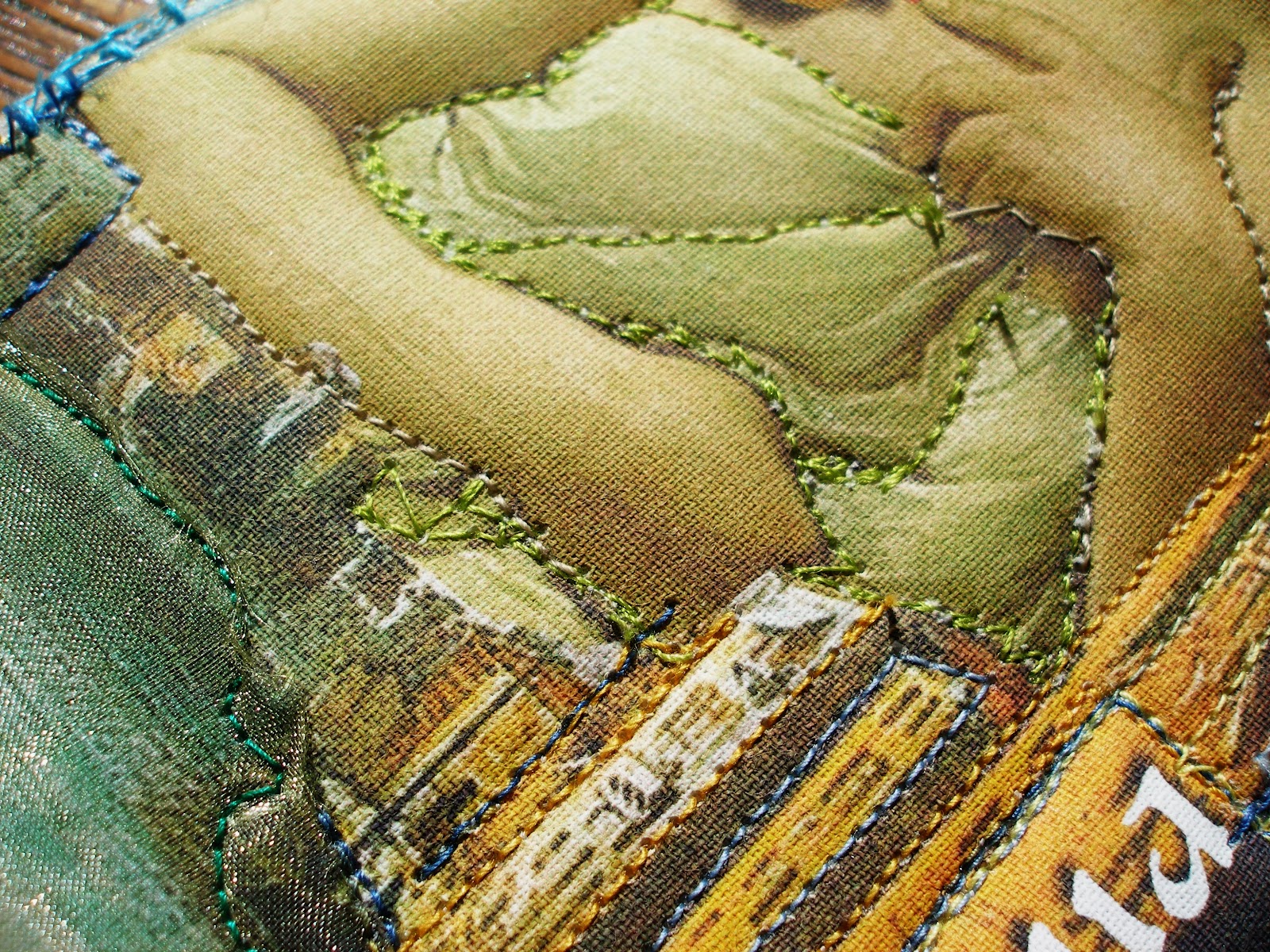
"Beauty" - digital illustration

Image Credits:
Tumble Fish Studio - all images with the exception of
Holliewood Studio (garbage can)


Friday, April 22, 2011

The Princess and the Pelican Puppet

--------------------------------------------------------------------------------
How many frogs have you kissed?


 Especially when your Mother was watching...


Have a cup of tea, and see if you can remember?


The Princess and the Puppet Pelican
8x10 Digital Illustration

Image Credits:
Holliewood Studios, Lisa`s Altered Art, Lorie Davison, N. Perry, Tumblefish Studio, Finecrafted Designs, Martha Van Eck  and public domain images, most noteably, Sir Edward Coley Burne-Jones (1833-1898)


Monday, April 18, 2011

Experimenting with Golden Digital Ground Clear (Gloss) Inkjet Transfer Method

--------------------------------------------------------------------------------
Good Morning!  

 If you've been following my blog for awhile,  you will already know I have recently been experimenting with various methods and products used for inkjet transfers.   You may recall a previous post, discussing my results with Lesley Riley's TAP (Transfer Artist Paper). If not, here is the link to that post.

If you are at all like me, I often come across a new product through a blog post or a video that looks like the next best thing to sliced bread.  I get excited and enthused and   purchase the product, convinced it will be 'the answer'!   By the time the product arrives, I have 'moved on' and it sits. 

 This is the scenario that occurred which lead  me to  shelving a 16 fl. oz bottle of Golden's Digital Ground Clear (Gloss) in my studio for over a year.

But,  I found the right amount of time last week to experiment.  I dusted off the bottle, and armed with a wide household paint brush proceeded to throw caution to the wind ! 

Please keep in mind, I am not AT ALL professing this is the BEST or most efficient method for using this product.  On the contrary.  What I am sharing with you is my own personal method gleaned from a variety of different sources I've accumulated via word of mouth and research combined with   my own experiences.     My purpose is to provide an 'at-home' experiment with the goal of informing you so that you may perhaps benefit from my trials and ERRORS which may ultimately save you time and money and GRIEF!


Step 1 - Prepare your fabric by cutting it into sheets close to 8.5 x 11 inches.  Take regular freezer paper and do the same.  Iron the paper (shiny side facing the fabric) and the fabric together.  Optional - to increase the stability of the two layers,  I also opted to  adhere a strip of packing tape onto the top edges of each to create a straight stable edge.  I don't know whether this was necessary, but with both sheets I experimented with, the printer accepted them without incident. 

Step 2 - (and photo above) Apply  2 coats of the digital ground.     In all, I probably applied about an ounce of the fluid.  Although the product is "gloss" my experience was that it did not appear to be glossy when applied to the muslin.  The muslin readily absorbed the fluid.  The product also hardened the surface of the fabric slightly.  NOTE:  This product  is NOT odor free and for your health and safety, READ the label on the back of the bottle and avoid contact with your skin.

Step 3 - Let it Be.  I left these to dry for 2-3 days.  Not that they needed that much time.  The information on the bottle advises the ground must be left to dry between coats.  It doesn't say how long to wait until you feed it through your printer. 

Note:  (not photographed)  Before feeding these into the printer, I trimmed the edges  so that the freezer paper and the muslin were even. 


Step 3 - Choose the image you want to transfer. Above is a digital illustration directly from the computer.
Because I wanted to maximize the size of this image, I printed it out and photographed it (below)


Above - photograph of  the printed digital illustration - can you see the difference between the 100% digital and the photograph? 


Above - Cropped portion of the photograph of the digital illustration


Above  is the result of my first print.  Also - WOOPS Lesson #1 - remember the packing tape I adhered to the top of the prepared fabric?  The top part of my image printed directly onto the packing tape instead of the fabric.  On the PLUS side, and as I eluded to above, it did allow the material to feed easily into the printer.


Above - result of second inkjet transfer - knowing  from my WOOPS above that I had to 'clear' the top edge with the tape, I digitally shifted the top edge of this image down so that it would transfer on to the fabric and 'miss' the tape. 

The images successfully  illustrate that with each subsequent  transfer eg) from  original digital to photograph to crop of photo and finally  to transfer onto the cloth substrate,  it's easy to see the details of the image deteriorate along with variations in the intensity of the colors.    

Follow Up: 

  • One of my favorite expressions is "Take my advice - I'm not using it!"  In other words, I invite and  encourage you to please add your own experiments and lessons learned using  this inkjet transfer method in the comments section along with links to any of your own results!    It will  help me to improve and refine this technique as well as other artists searching for answers. 
  •  I am also curious to know suggestions on what products to use to UV protect these transfers.
  •  Have you done the math?  One of my goals is to create a cost comparison based on 'price per page' for each of the various transfer techniques, but perhaps it already exists somewhere? 

Thanks for reading!


Saturday, April 16, 2011

Dot. The world's smallest stop-motion animation character shot on a Noki...

--------------------------------------------------------------------------------
I stumbled across this darling little video and felt compelled to share it with you! Have a wonderful weekend!

Wednesday, April 13, 2011

I can't think of

--------------------------------------------------------------------------------
any reasonable explanation for why Evelyn's new work - Your Inner Voice captured my imagination with such ferocity.   I continued to stay true to my goal to return more toward non-digital work, but felt compelled to devote some extra 'art' time to working with her new images.  Is it just me or do they also speak to you?  And if they do, what are they trying to express?


 Room With a View


 Tears from Heaven (Eric Clapton)


 Creation


This next piece was inspired by a poem by Pablo Neruda.  I have been reading from a translation of some of his poetry from a book  titled Full Woman, Fleshy Apple, Hot Moon - as translated by Stephen Mitchell.


"...After your long journey
feathered magnolia
triangle that the air
holds up into the heights
slowly you come back
to your form
closing
your silver garment
ovaling your brilliant treasure
become once again
a white bud of flight
round
seed of
beauty..."

 Surrender


 Portal to Infinity


Oxygen

Image Credits:
Room With A View, Tears from Heaven, Creation
 - 100% Finecrafted Designs "Your Inner Voice"
Oxygen - Figure - Finecrafted Designs plus my own images
Portal to Infinity - above and Finchly Papers and thanks to Mrs. Inman of Flickr
for the moon and the parrot and to JoeSistah for the room behind the stars
Surrender - above and Lorie Davison

As always, thanks for visiting!

Monday, April 11, 2011

The Butterfly Effect - Update #20

--------------------------------------------------------------------------------
My apologies for the delay in posting Update #20 of The Butterfly Effect.  I have been delighted to receive the latest 23 butterflies over the past 2-3 weeks.   Each one, like the Holocaust children, unique and special in each and every way. 

Please accept my sincere appreciation on behalf of the Holocaust Museum Houston project!   We are now closing in on 200 butterflies! To be exact - 183 - more than I ever dreamed possible and with almost  9 months still left,  we are just at the half way mark!   But, even more time exists if you opt to mail your butterfly direction to the Holocaust Museum Houston where the deadline is June 30th, 2012.


Sherry Harmes
Eagle River, Arkansas, USA

Yellow:
- inspiration was a poem by Pavel Friedman. Though this is a yellow butterfly, it is not free as it is literally tied down to the background by its buttons.  The body is meant to look as if it were wrapped in funery rags.  Too many of the children of the Holocaust did not even have that.


Sherry Harmes
Eagle River, Arkansas, USA


Red:
- inspired by the death's head moth.  Background paper for this butterfly  is from the Wikipedia definition of Holocaust as well as words about crematoria and Joseph Mengele experiments and changed the font to Vivaldi and decreased it to 8 pts.  The butterfly is struggling to leave the page as it is too painful for even death to contemplate.  The body of this one too is wrapped in funery rags.  The red's are for all of the blood shed.


Sherry Harmes
Eagle River, Arkansas, USA


Oragami:
made with 2nd page of the above described "Holocaust" paper.


Amber and Brock  Wolsfeld
Winfield, Illinois, USA


Starting with Sharmon Davidson's butterfly, and followed by 15 others, Sharmon inspired the Art Club at Camp Ernst Middle School in Burlington, Kentucky!   Thanks to everyone there!


Sharmon Davidson & Students
Camp Ernst Middle School Art Club
Burlington, Kentucky, USA


And last, but certainly not least, all of the way from Northern Ireland, Carrie sent her butterfly across the ocean....


Carrie Gault
Co-Antrim, Northern Ireland, UK


Mary's "Green Paper" - April Challenge

--------------------------------------------------------------------------------
Check out Mary's April 2011 Challenge here


"Close to Home" - digital illustration/collage

Sunday, April 10, 2011

30 done - Z E R O left!

--------------------------------------------------------------------------------
My final skinny pages are finished!  16 months and 30 pages - and I'm looking forward to moving on to new projects.  I photographed this skinny as a work in progress a few weeks back, so below is a montage of the final pages along with a few macros.  Owing to the lack of light, they appear much darker - which based on the theme of dreams and my translation of a dream that leant itself to the moon and the stars, the darkness adds to the mood. 

I really used a variety of different materials on these pages.  Hand embroidering french knots and a baseball stitch, seed beading, adding vintage lace, regular lace, buttons, sara silk ribbon, tatting, ric-rac, plus several different colored threads and various machine stitches. 

Over the past year and a half I  have received so many amazing pages, each member of this group showcasing their talents and flair for composition time and time again.  Before too long, I hope to be able to post some photographs of the incredible 'skinny book' that resulted from our collaborative efforts. 

Stay tuned for Update 20 of the Butterfly Effect which is my focus for tomorrow!  Happy Sunday.


4 x 8 inch Fabric Skinny Pages and Macros - for Caryl - "Dreams"
(Left click on the image to view large)

Original image credits: 95% Tumble Fish Studio, Stars - Tangie Baxter


Saturday, April 09, 2011

28 down and only 2 to go!

--------------------------------------------------------------------------------
A couple of months ago I posted about a faux pas I made creating two fabric pages for a project that started 16 months ago.  These pages were to be theme "Venice" and I was careless when I read the specs and incorrectly created my work based on "Vienna"!  Looking back, I wonder if part of this mistake had anything to do with the anxiety I was experiencing.  These pages were for Frieda Oxenham, a talented and award winning quilter from Scotland.  There have been three people who have definitely been my sources of inspiration since I began exploring textiles - Viola, Beryl Taylor and yes, Frieda!  Links to each of their websites are on the right hand side here.

I am grateful for this challenge though as it pushes me to continue to improve on my skills in hand and machine stitching as well as beading and embroidery. 

So, without further ado, here's the before and afters along with a few macros !  I have one set now 80% complete - my last two pages and this sixteen month project will have reached its conclusion.

Thanks for reading and don't forget to click on the bullseye above to the right to enter the giveaway.


.