Thursday, April 07, 2011

Plenty of time for adulthood.....

--------------------------------------------------------------------------------
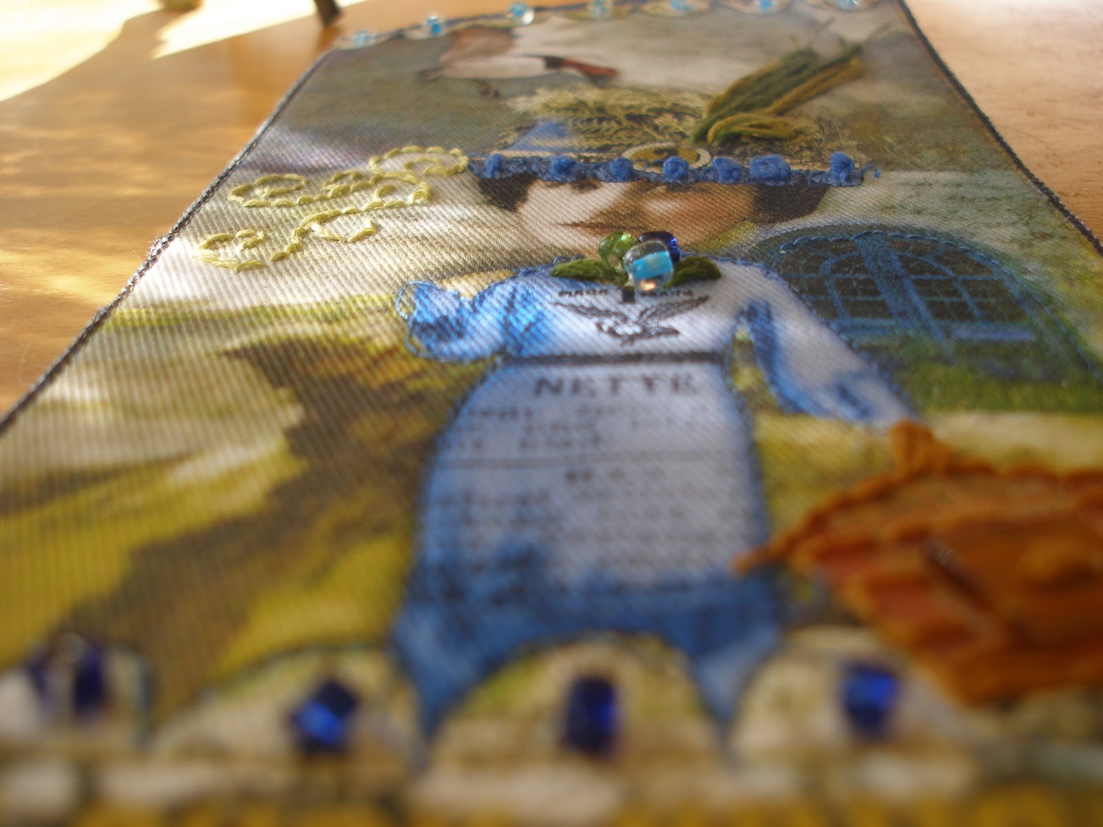
After The Game - digital illustration

Image Credits: 
 Lewis Hine (figures), Holliewood Studios - baseball, car, Tumble Fish Studio - moon, wing

I hesitated to post this illustration after hearing from a friend about the recent contraversy surrounding a "push up" bikini for  7 - 14 year old girls  - but instead of me paraphrasing the contraversy - I've included below an article/opinion as reported by   Megan Sorokes Olean Times Herald

I endorse her views.


"It started with a teaser for a red and white striped, push-up bikini. It’s that time of year when everyone is starting to think about swimsuit season and preparing for the beach, so of course it makes sense that morning shows would start airing segments about summer apparel and popular trends.

And a red and white striped bikini seems harmless. It’s just another option for the beach … but for 7 to 14-year-old girls?

That’s right, Abercrombie & Fitch did it again. The popular clothing store, known for its racy advertising targeting adults, sparked another debate on appropriate clothing for teenagers and young children, and this time it is outrageous.

Only a few seconds of listening to the news segment on “The Today Show” brought both a spike in my blood pressure and a tear to my eye ... and I don’t even have children. Could they be serious? Why on earth does a 7-year-old girl need a push-up swimsuit? A bikini no less?

And that’s not all. Later this past week, my irritation resurfaced when the same morning show reported that a British beautician who allegedly administers Botox injections to her 8-year-old daughter. While the “The Today Show” questioned the truthfulness of the claim, which originated with a British tabloid, the underlying, blood-boiling issue remained: children are being pressured to grow up too fast and meet unrealistic standards.

I don’t remember every detail of my childhood, but I know for a fact, at the age of 7 or 8, I didn’t worry about my weight, wearing makeup or buying designer clothing. Rather, my greatest concern was whether I could stay up late to watch my favorite show on the Disney Channel, that my Mom stocked the cereal drawer with delicious, sugary cereals for snacks and Saturday morning breakfast — the only time my siblings and I could eat it — and that she washed my favorite jeans.

Life did not revolve around “grown-up” concerns: a scale, a diet, certain sizes, styles or figures, flat-screen TVs and financial success. That came later in high school and college when the doors are supposed to close on childhood and open into learning the adult ropes.

Again, when did the concept of childhood change? It seems as though almost every ounce of innocence that once defined “being a kid” has been drained and depleted. What used to be acceptable behavior for teens and tweens is now becoming prevalent among younger children — acceptable or not.

Boys strive to be tough, macho or athletic, focusing on the behavior of their favorite all-star athletes, who may or may not be positive influences. For young girls, perception depends upon appearance, clothes and popularity with boys as gleaned from actresses, singers and magazine cover models. Yes, even at age 8. It is not uncommon to hear children gushing about boyfriends and girlfriends and it meaning more than pulling hair or teasing during the school day. There is sexual innuendo involved, further revealed by news reports of increased promiscuity among children. Not adults. Not teens. Children. My heart broke when a family member told me about a conversation her young child had with a friend at school involving such activity.
While the media is not entirely accountable for the shift in child and teen behavior, its influence is undeniable. On Saturday, Nickelodeon hosted its 2011 Kids’ Choice Awards, which is targeted toward ages 13-and-under, although anyone can vote. Nevertheless, the nominees for various categories surprised me, though I guess they shouldn’t have. The favorite male singer choices included Justin Beiber, Jay-Z, Bruno Mars and Usher. I fail to see the childhood influence in those options, especially given the language in some of the songs. Granted, I don’t remember what I listened to at that age, but it certainly didn’t have an explicit parental warning.

I fear for children. It’s infuriating to hear a little girl complain about her weight or a boy being picked on for preferring science experiments over sports. As a youngster, adults constantly reminded me to enjoy being a kid and not to grow up too fast. Kids and teens today are under just as much pressure to perform and conform as many adults, and sometimes it seems the time demands and expectations placed on them is just as high.

That’s not childhood, nor is it fair. They deserve that care-free, imaginative period in life. There’s plenty of time for adulthood, for the responsibility, accountability, pressure ... and push-up bikinis."


Monday, April 04, 2011

New Creative Team Digital Illustrations

--------------------------------------------------------------------------------
Good Monday afternoon from snowy Southern Alberta!

I am keeping to my goal but I did 'have to' create one digital over the weekend ( I say "have to" because my previous post on Friday I profess about turning off the computer !)  Not that I minded!   ...at all....!  And, I also am catching up with other creative team projects.  Over the next few days, I'll be sharing some of those illustrations that came to life during the past 3-4 weeks.

Hollie H.,  owner of Deviant Scrap and designer for Holliewood Studios released a funky new digital PNG kit - "Art Dollies 2".  If you are familiar with her Art Dollies 1 kit, you'll be  as delighted with the assortment of whacky images in this new release.  Available here.   Thanks Hollie.

"The Lamb-a-Dolly" - digital illustration - 8 x 10 inches


And prior to my 'vow' of getting back to hands on art, Evelyn  from Finecrafted Designs released "Meet the Mandrakes" - check it out if you are looking at getting 'uprooted'!

"Grounded" - digital illustration

Image credits:
 Finecrafted Designs and Tumble Fish Studio (water)


"This one makes you taller...." - digital illustration

Image Credits:  Finecrafted Designs
Meet the Mandrakes and figure by Dove Stock - DeviantArt


"How Does Your Garden Grow" - digital illustration

Image Credits:  Figure - Lewis Hine
 all other images Finecrafted Designs - Meet the Mandrakes


Thanks Hollie and Evelyn!  It's such a treat to work with your images!  OK - back to the 'hands off' the keyboard creating!

Sunday, April 03, 2011

Two Great Reasons to stay indoors and have a Creative Weekend....

--------------------------------------------------------------------------------

1.  When brushing the snow off your car requires a ladder.

2.  When  it's April 3rd and Mother Nature decides to knit a hat for your Buddha statue.


I'm not complaining.  I know things could be a million times worse.  And, I am feeling the satisfaction of catching up on lingering projects, plus the beginning of new creative musings taking form.

Several months ago ? or was it a year or two? I purchased several sheets of TAP (Transfer Artist Paper) used commonly by textile and surface design peeps to transfer images onto fabric.  Having recently  suggested it to a friend, I thought, hmmmm...maybe I should take my own advice for a change!  If you've not heard of it before, here's a link for you to Leslie Riley's (the manufacturer) website and store.  Instructions are also included in the package.

What follows are  images of my experimenting throughout the weekend, some tips, along with  a mini-tutorial as  a beginner with this product.  I welcome comments, tips and suggestions from any of you reading that have had more experience with this product. 


Images printed from computer onto TAP paper (I printed two of the same just to experiment with transferring onto two different fabrics.)

Images face down and ready for an iron at the highest setting - one on cotton, the other on organza.

 Result of image on cotton - if you look at the figure's head and area around it - you can see I didn't leave the iron on quite long enough to get the full transfer of the head.  Learn from my mistake and make sure all areas have been pressed sufficiently with the iron.


Here's the image on organza - very transluscent.  CAUTION - when transferring onto a porous thin fabric like organza, the transfer image will 'soak' directly through it and onto the surface below.  This makes it tricky and it goes without saying, I need more  experimenting on this method. The TAP will also make a mess of your iron and ironing board cover potentially.  I read the instructions and opted to use a Teflon sheet (a piece of parchment paper would work too) as a barrier between my iron and the paper. 

From what I can tell, TAP is a 'carrier' that has a substance similar to a polymer medium evenly applied to it.   If you've tried a matte medium transfer in the past, you may agree the results and patina are similar.  But to be clear, this is different from a t-shirt transfer product.

 Here are a few initial  advantages in purchasing this product -
  • the resulting image is transluscent, making it a great choice if you want the surface you are transferring it onto to show through - as you can see above in the "See Dick and Jane" fabric. 
  • no mess, no unhappy accidents, no clogged printers
Now, some potential disadvantages -
  • you are restricted in size to 8.5 x 11 inches
  • although I haven't completed a direct cost comparison, each sheet of TAP, if purchased in a package of 5 - is approximately $2.60 per sheet (plus shipping and handling.) In my world, that isn't cheap, particularly considering the experimentation I will undertake to explore the various potential applications in fiber arts.
Another tip comes to mind when considering the price.  It is economical to 'map out' your digital sheet when you're in front of the computer and preparing the image to print,  by  adding  other images in the empty spaces of your primary image.  For me, this is sometimes distracting as I become very focused on the project I am beginning to create.  So, searching through my database for other images to fill space leads  me out of that 'zone.'  This thus  is a comment on the importance of planning.  One suggestion is to add 'letters', phrases, or other smaller images  to keep as a 'stash' for future use.  You may want to print your name as a signature to add to your final fabric piece as a tag. 

Back to the area around the head - to fill in the missing bit, I used a pan pastel and then applied a thin coat of matte medium to seal it.  Since this is and experiment,  not meant to be a 'garment' and will therefore not be laundered, I chose this because it was close at hand.  Perhaps a more permanent solution would be to use an full bodied or liquid acrylic or Inktense colored pencils.  Other possibilities would be to use mediums specifically designed for fabric - unfortunately, being new to surface and textile design, I don't have any!


Pan Pastel to 'fix' missing portion - I am not recommending this...but it did the trick in a pinch.


The work in progress -


Here's a better photograph of the antique wooden bobbin spool I've 'laid out' to 'eye' in the above photograph - see below credits on where you can purchase them and tell Lisa, "Two" sent you.  I think they are a great way to hang a fabric piece and feel good that you are 'repurposing'.

 Antique Wooden Bobbin Spools (approximately 10 inches in length)
(photo courtesy of Lisa Jurist - Mudhound Primitives


This is  where the project 'sits' right now - I've added a layer of organza over top of the figure to visually differentiate it from the background.  I'm also playing with the neckline and sleeves as well as the hem of the dress.
Decisions are whether or not to make this a pillow or a wall hanging and you can see I am adding layers visually but as yet, unattached -   'playing' around with the illusion of a sky behind, (see credits for link to source below)  as well as the ground with another piece of fabric - an image of grass combined with a map.    I don't like the area of white at the top of the grass print and am trying to blend it in by outlining with the machine stitching  leaves of grass extending beyond the edge into the original fabric.  I've also begun adding some machine stitching over the organza area in the dress to create the illusion of wrinkles. 

Suggestions, advice, technique links and comments very Welcomed~! 


I am also very late in announcing an article and mini-tutorial on The Duck Whisperer (below).  It is published in the Spring 2011 publication - Somerset Apprentice


The Duck Whisper - 4 x 8 inch mixed media textile art
Tutorial published in Somerset Apprentice Spring 2011


Credits for mini-TAP tutorial: 
 Hand dyed vintage doilies and grid in TAP piece
Figure - Paper Whimsy, Grass - Maya (Scrapbookgrapics)
Antique wooden bobbin spool - Lisa Jurist  and purchased at her Etsy shop here 


Thursday, March 31, 2011

Wrapping up...

--------------------------------------------------------------------------------


 While wrapping up a couple of  packages from Etsy sales this week, I was reminded  again of  how much I enjoy 'hands on' as opposed to 'hands on keyboard'  creating.  So with a few days of solitude on my hands this weekend, I'm intending on minimizing my digital creating and maximizing my fabric and mixed media cravings.  Change is calling me.


Although, I have to say, I love some of the new textures, stamps, overlays that seem to be showing up everywhere I look these days. The little stars 'stamp'  at the top of the illustration below is but one example from Holliewood Studios "Kitsch" kit.  My favorite is the "Journal Junk" kit with a variety of 'stamped' images and great papers to layer.  I made this card for a dear friend who suffered a stroke last week at 46.  Change is coming her way now too. 

"Pony Express"  8 x 10 inch digital Illustration
Image Credits -
C. Renee
 Tumble Fish Studio
 Tangie Baxter
Holliewood Studios
 Finecrafted Studios
Crowabout Studio B


While my  internal jury was still deliberating on whether I would pursue more compositions with an abundance of negative space, I decided to print my latest experiment onto cloth .  Earlier this week I  took to the sewing machine and came up with a quick miniature art pillow - perfect to cozy up along side some of my favorite Bantock books.  I am still a real novice when it comes to sewing and the stitching you may be able to see on the photos below,  seemed  off, as in flat.  Eventually I figured out I'd put the bobbin in backwards.  The one consolation was I had  a fat square of the bullseye-esque fabric (actually it probably resembles a more African motif)  which I thought tied in to the details in the composition. 


                                       Mini Art Pillow - "Take One"


Speaking of Nick Bantock - my muse was flying by the seat of her pants and as I was taking the above snapshots, I had to take a little break to have a visit with the king of collage.  Particularly in light of the news he has just released The Venetian as an APP for iPad - wonderful news!  I've been wondering when he would surface once more after his exhibit in Colorado and was happy to hear his wonderful prose and collage will reach a wider audience!  Check it out here -  http://www.facebook.com/#!/thevenetianbynickbantock or for  a measily $4.99 go directly to iTunes to purchase it here  http://itunes.apple.com/us/app/the-venetian/id425447380?mt=8  It makes me want to go buy an iPad!

I told Nick straight up that my goal was to make art that looked just like his.  Give me another 50 years and I may come close.  But it never hurts to try and despite my intentions to get off the digital kick, I did succumb only because of how IN SPIR ED I was after turning just a few of the pages in the Griffin and Sabine trilogy...I love mail art! Below, my best effort to 'lift' his style...a goal in progress....


Madame Pelican Mail
digital illustration work in progress - 20 x 12 inches

And to satisfy your literary cravings, here's a little poem by an unknown author on this very subject -

A wonderful bird is the pelican,
His bill will hold more than his belican.
He can take in his beak
Food enough for a week,
But I’m damned if I see how the helican.
 
 
Thanks for reading!  Stay tune for ...more changes.... :0)

Sunday, March 27, 2011

Magic Series !! Bullseye? - Giveaway for April

--------------------------------------------------------------------------------


"Tip of The Hat"
Magic Series #2 - art illustration print
Dimensions - inside square approximately 8 x8 inches


"First Star I See Tonight"
Magic Series #1 - art illustration print
Dimensions - inside square approximately 8 inches


Image Credits:
Holliewood Studio
Tumble Fish Studio
Paper Whimsy
Finecrafted Designs


I am really excited about this new series I've coined "Magic".   The second image has been "in process" for months and months - as I worked and reworked it.    Then, on Friday I picked up a copy of Feb 2011 Quilting Arts magazine and the work of several of the artists in the issue just resonated so strongly  and I was able to finish the second image and create a companion to the series.  Now, nothing that I've created resembles the contents in the magazine.  I wish.  What I experienced as I flipped through the pages,   was more the notion  of the use of positive and negative space that seemed to 'gel'.  Now,  #3 is in my mind, and I have several ideas percolating.  So many, that I am wanting to hurry through this blogpost to get back to it.   

What I think, or feel,  is that  I am at the beginning stages of creating the type of illustration/art/images that really seem to spell M-E.    I've been dabbling in mixed media, altered art, illustration and all manner of crafting and techniques related to these different genres for upward to five years now, occasionally feeling like I was getting closer, but not 'spot on.'  The small black and white bullseyes you can see within each piece reflect this excitement and this 'spot on' feeling!  The other grey ones are just watermarks!
I look foward to creating more in this 'style' and hope that I'm not just 'pipe dreaming' as quite often I become infatuated with my current musings, temporarily  - not unlike seeing photographs of me as a teen with 36 inch bell bottoms or "flares" and gasping at how I ever managed to be seen in public!  But oh I loved them then.    The kaboom lasts for a few days or weeks, then  passes,  I get back on the horse, to travel to other places with my muse.

For this time, yet not the first time, your feedback and comments will be extremely helpful to me as I decide whether or not I will 'settle in' to this style.  I have visions of taking these images to cloth, watercolor paper and canvas and think of how much I'd love toss cushions or even an art quilt created out of several squares.

And, in an effort to encourage feedback, I'll  have a give-away in April and draw from the comments (regardless of whether they are negative or positive !!) and send one set out to that person.   In order to qualify,  leave a comment with a link on how I can get back to you should you name be drawn.  Of course, you are more than welcome to travel on over to Etsy where you`ll find them  both listed.  I`ve reduced the price of my prints by eliminating the matting - this makes it not only less expensive materials-wise, but also less costly to ship!   This was suggested by blog readers several months ago!

Thanks and good luck!


Saturday, March 26, 2011

Sunday Postcard Art - White

--------------------------------------------------------------------------------
Sunday Postcard Art - White 4 x 6 inch digital

Image Credits:  Tangie Baxter, Dove Stock - DeviantArt.com, Holliewood \Studios - Stark,

Thursday, March 24, 2011

--------------------------------------------------------------------------------


Hurray!  My February 2011 project is now complete.  I had originally started out with a modification of one of my old blog headers for this project as it seemed to fit   Karen Owen's theme - Grandmother's Attic.     But THEN, Holliewood Studios came out with a wonderful package of images entitled "Auntie Em's."  Since I will be a month late in mailing this to her, I thought I'd add in a 3rd page. I also never send only the prints of digital illustrations but instead either transfer them onto cloth, or cut and paste them.  So, thinking the Granny's Attic page was a bit of a short cut  I created the page to the right, unable to resist the look and feel of  texture. 


Extra Skinny Page - 4 x 8 inch - cut and paste illustration


Blurry Close Up


The below images remind me of my visits to my Grandma's house when I was a little girl.  She had this wonderful attic that was a perfect place to hide from my cousins along with this fabulous junk drawer that was a mile wide and full of things JUST for her grandchildren.  Did you ever yell "All ye all ye outs and free" when you were 'it' in a game of hide and go seek?  I was always "it" I swear.  I only had two girl cousins who were older, I was the youngest and my boy cousins always seemed to cajole me into being 'it'.  I recall summers at the lake when I would get so frustrated playing Kick the Can, "it" again.  Once I filled the can up with sand and just went back inside, leaving them hiding - they may have been bigger and more able to climb trees, but I outwitted them.  Early lessons in girl power!

4 x 8 inch Skinny Page (back) - Granny's Attic - digital illustration with embellishments

Close up of the little round page "pebbles"
4 x 8 inch Skinny Page Front - cut and paste with transparencies, vintage laces machine stitched on and "Fantasy Film" - ironed and pasted.
This is a close up of the transluscent "Fantasy Film" I cut and glued over the glasses to create 'rose colored glasses"  Fantasy Film comes in a variety of different colors and is available here   You can sew  it, layer it, glue it onto other substrates with a subtle transparency.


Image Credits - for the backs of each page and Address Label

--------------------------------------------------------------------------------
In between getting serious about some major spring cleaning this week, I stole a few snippets of time since my last post to move closer in the direction of finishing some already overdue project commitments.  If for no other reason than to relieve my guilty conscious as being late weighs heavy on my mind, I am posting updates to three works-in-progress below.  I hope they also may spark some creativity to those of you looking for a bit of color or inspiration to kick start your own spirit!


Below, one side of a skinny page with another one of Lewis Hine's famous figures - all of the various images now cut and ready to hit the 'paste' ... while I was cutting these out, I happened upon The Story Of The Day by Brian Andreas that seemed to fit in here -

Riding The Pony - Brian Andreas

"When I was younger, my favorite thing was riding the pony outside the Safeway. My dad always said I should save my money for something better, but I could ride for miles all over the West & always end up back at the Safeway & all it cost was a quarter & I still can't think of anything better than that. "


And the image that inspired the above by Lewis Hine -


I've also found myself back in the mood to bead and embroider - and thanks to Auntie Marsha, I have an amazing stash now of vintage tatting!   I hand stitched the soft pink and yellow tatting to the page with green and pink embroidery thread.


And, still waiting for the 'right' inspiration to finish this off -


As always, a big thank you  for following, reading or commenting on my posts!

Sunday, March 20, 2011

More Cut and Paste ATC's as s o o t h i n g Art Therapy!

--------------------------------------------------------------------------------
Seems I had a bit of a 'run with scissors' over the past few weeks, and  enjoyed creating some cut and paste ATC's - good therapy for me.....


Here's a few photographs....starting with -


....a face from Paper Whimsy, a body from Lewis Hine, and wings from Tumble Fish Studio...


then out came an old postage stamp with more images from Paper Whimsy, Tumble Fish Studio and the background of one of the "see below" ATC sized notecards....I ended up applying a coat of Golden Soft Gel on this one....more texture...and well, I think it came out to hide a bit of glue that got away from me!


.....the little figure below is thanks to  a  Land of Nod 'freebie'  and she  became an instant favorite - b e c a u s e I have a favorite blanket too!....(little known secrets)  from Two.....along with more funky borders, tickets and wings  from Tumble Fish Studio and a background from Finecrafted Designs "Full Steam Ahead"


Plunked them all in a little 'see below' envelope....


 I also created a new notecard and matching envelope (2.5 x 3.5 inch-sized)so I had  a way to package the ATC's since I usually trade these or use them as little thank you gifts.


I loved the kaliedescope of colors in bits and pieces that start out from some of Tumble Fish Studio digital wonders!  So, I decided to create similar designs in three different colors....oh, how one thing leads to another and another.... so - below are 3 different color families - I've listed these matching cards and envelopes for digital downloads on Etsy


Finally, after looking at Terri's,  (Pringle Hill Studio) Tracey's  (Glitterbug) and Kate's (The Katherine Wheel) - see sidebar for links to each of their sites,   funky journal calendars for months and being continually inspired by their artwork,  - I did resort back to the computer to create a digital calendar for April - again using the Lewis Hine image  that I had (see below) extracted and colored as a start - these could be habit-forming!!!!


Here's the original photograph from Lewis Hine: 


And with a little bit of digital magic....it slowly transformed.....


I don't know if I am finished with this yet - I love the detail Lewis Hine captured on his shirt and the simplicity of the pose.....

Digital Illustration from Lewis Hine photograph - 8 x 10 inches


Thanks for reading and have an artFULL day!